As an artful photographer with two decades of capturing family histories, I’ve become intimately familiar with the silent yet vibrant language of colors. In the nuanced world of family portraits, color doesn’t merely fill space; it sets the stage, speaks to the soul, and weaves a narrative without uttering a single syllable. Through this dialogue, we photographers guide emotions and craft stories within each frame. I invite you to unlock the secrets of color theory to elevate your family portraits, transforming them from simple images to captivating stories imbued with depth and feeling.
The Basics of Color Theory
At its core, color theory is an essential framework for understanding how to use color effectively. It’s grounded in the color wheel, a visual representation of colors arranged according to their chromatic relationship. In this wheel, we find primary, secondary, and tertiary colors—a kaleidoscope from which all other hues are derived. Comprehending how these colors mix, match, and contrast will equip you with the ability to craft harmonious portraits that are visually appealing and emotionally resonant.
Harmony and Contrast
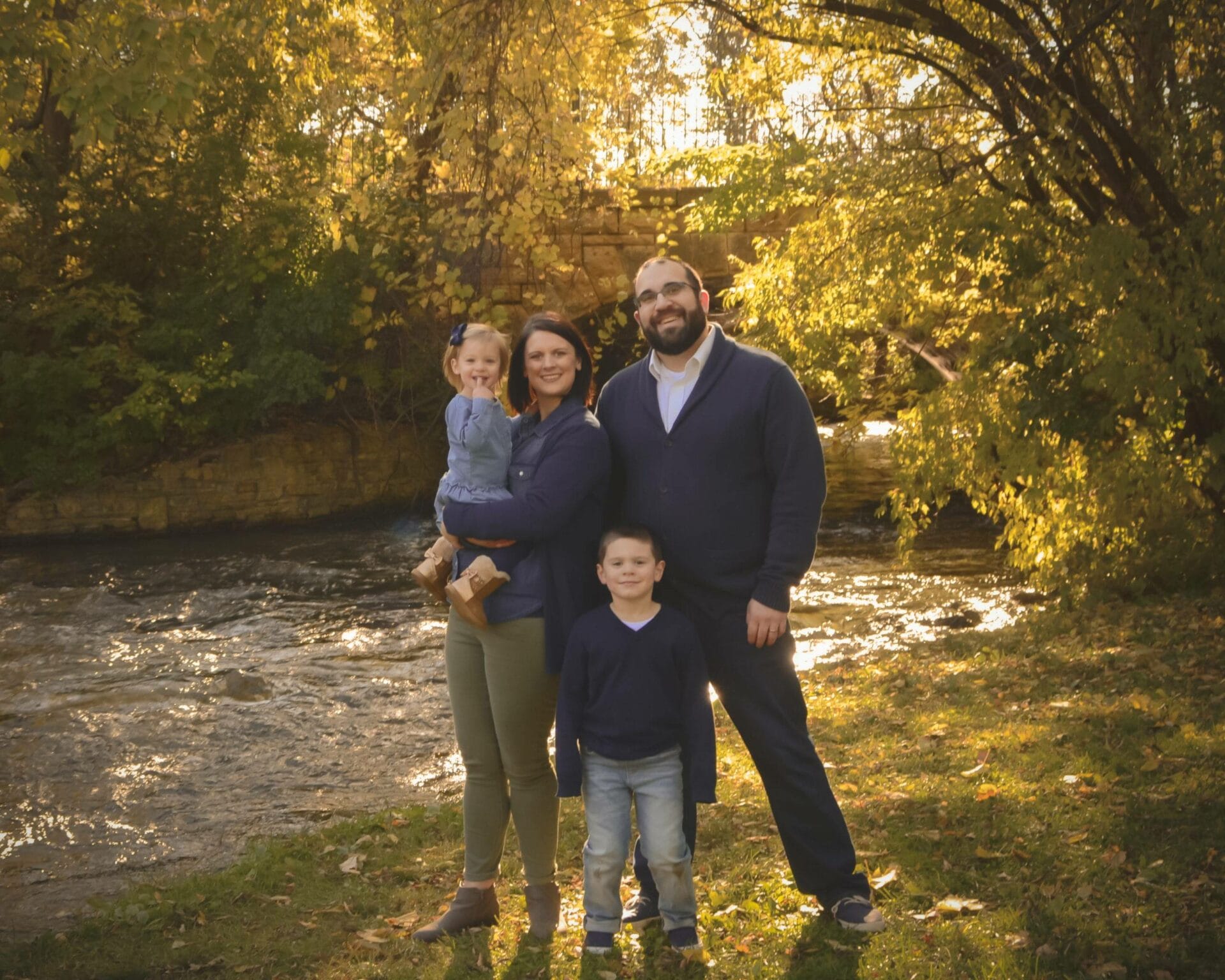
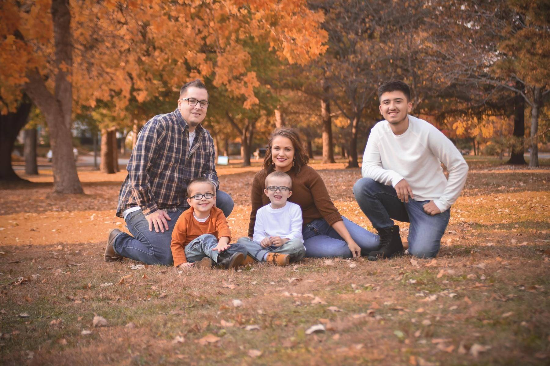
Harmony in color is akin to a well-rehearsed orchestra—each element complements the others, creating a pleasing collective whole. Analogous colors, which sit side by side on the color wheel, provide a sense of unity and blend smoothly on the canvas of your portrait. For example, dressing a family in varying shades of autumnal colors—mustard, rust, and ochre—against a backdrop of fall foliage creates a comforting uniformity, portraying a bond that is both warm and inviting.
In contrast, contrasting colors, found directly opposite each other on the color wheel, serve to create vibrancy and dynamic tension in an image. A red scarf or a cobalt blue beanie can become focal points, injecting life and energy into the photograph. These pops of contrasting color guide the viewer’s eye, highlighting aspects of the portrait that might otherwise go unnoticed.
Color and Emotion
Colors are more than visual stimuli—they are the whispers of emotion. Warm colors are charged with energy, passion, and vitality, perfect for creating an atmosphere of cheer and coziness. Cool colors, in their soothing silence, offer respite and reflection, ideal for invoking a sense of calm and relaxation. When selecting the color scheme for a family portrait, I often discuss with my clients the mood they wish to capture. Whether it’s the joyful chaos of a young family or the serene composure of generational gathering, the chosen palette sets the emotional tone.
Context and Environment
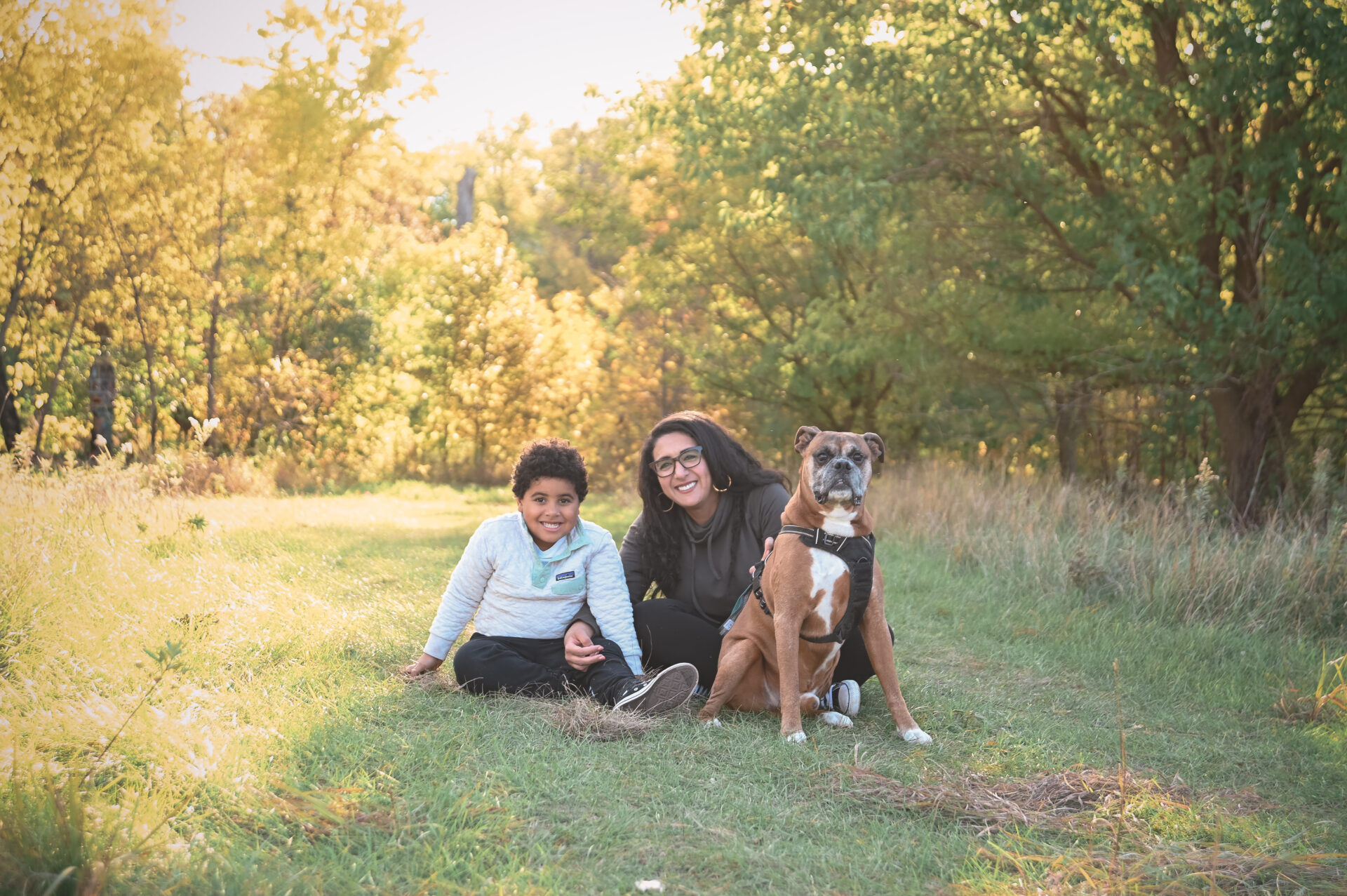
A well-composed family portrait takes into account the colors naturally present in the environment. Outdoor settings offer a tapestry of shades that reflect the season, time of day, and location’s essence. The verdant greens of a summer park impart freshness and vibrancy, while the neutral tones of an urban setting create a modern, sophisticated vibe. When planning a portrait, I advise families to consider their surroundings and opt for clothing that complements the scene, ensuring they stand out yet belong within the larger picture.
Seasonal color theory further enriches this narrative. Each season narrates its own color story—the rejuvenating pastels of spring, the sunny hues of summer, the earthy tones of autumn, and the stark contrasts of winter. I encourage families to draw inspiration from these palettes to emphasize the timelessness of their portraits.
Color in Composition
Strategic placement of color can define a family portrait’s composition. The deliberate choice of a bright hue against a muted background can signify a family member’s unique personality, while uniform colors throughout can symbolize unity and harmony. Color leads the viewer’s eye through the portrait, telling a story that unfolds with each gaze, capturing the fleeting, tender moments that families will look back on for years to come.
Composing with Color
A family portrait is akin to a painter’s canvas, where each color choice and placement serves a purpose. As a photographer, I often direct families to consider their wardrobe as part of the composition. A family wearing harmonizing colors can be positioned against a contrasting backdrop to create a standout image. Imagine a family dressed in soft creams and beiges, standing against the rich, dark greens of a forest; the family becomes the beacon of warmth in the coolness of the setting.
Conversely, a family could wear colors that match the environment for a more subtle and integrated look—a concept called color blending. For example, a beach portrait could feature clothing in blues and sandy tans, mirroring the scene and creating a sense of oneness with the location.
The Psychology of Color
Delving into color psychology enriches the narrative of a family portrait by tapping into the subconscious reactions we have to certain hues. For instance, blue, often associated with stability and trust, can enhance a portrait’s sense of security when chosen for clothing or backdrop elements. On the other hand, utilizing splashes of red can introduce an element of passion and dynamism, perfect for a family known for its lively and energetic spirit.
Understanding these psychological triggers allows photographers to tell a more profound story with their images, one that resonates on a deeper emotional level with the viewers. When families look back on their portraits, the colors will not only remind them of how they looked but also of how they felt at that moment in time.
The Cultural Significance of Color
Colors carry cultural significance, which can add layers of meaning to a family portrait. For instance, in some cultures, white is the color of purity and peace, while in others, it may represent mourning. Including cultural color cues in a portrait pays homage to the family’s heritage and can be a powerful way of honoring ancestry and tradition. This consideration is particularly important in diverse societies, where a photographer’s sensitivity to cultural color meanings can deepen the portrait’s significance.
Lighting and Color
Lighting plays a pivotal role in how colors are perceived in photography. The quality, direction, and color of light can alter the appearance and impact of the colors chosen for the session. Warm light, such as the golden hues during the “golden hour” just after sunrise or before sunset, can amplify the warmth of colors, while the cooler light of a cloudy day can make colors appear more muted. I advise families to consider the time of day for their session, as it can dramatically affect the mood and color tones of their portraits.
Color Consistency
In the era of social media and digital galleries, the consistency of color across a family’s series of portraits can also be crucial. Maintaining a cohesive color palette across various shoots over the years can connect the images in a subtle visual narrative, showing the family’s growth and changes against a consistent thematic backdrop. This consistency can be comforting and nostalgic when the portraits are displayed together in a home or shared across generations.
The Color of Trends versus Timelessness
While it can be tempting to follow the latest color trends in fashion and design, I often remind families that the goal of a portrait is timelessness. Trendy colors can date a photograph, while classic color schemes remain enduring. Neutral tones, for example, can stand the test of time and allow the focus to remain on the subjects rather than the fashion of a particular era.
Post-Production: The Final Palette
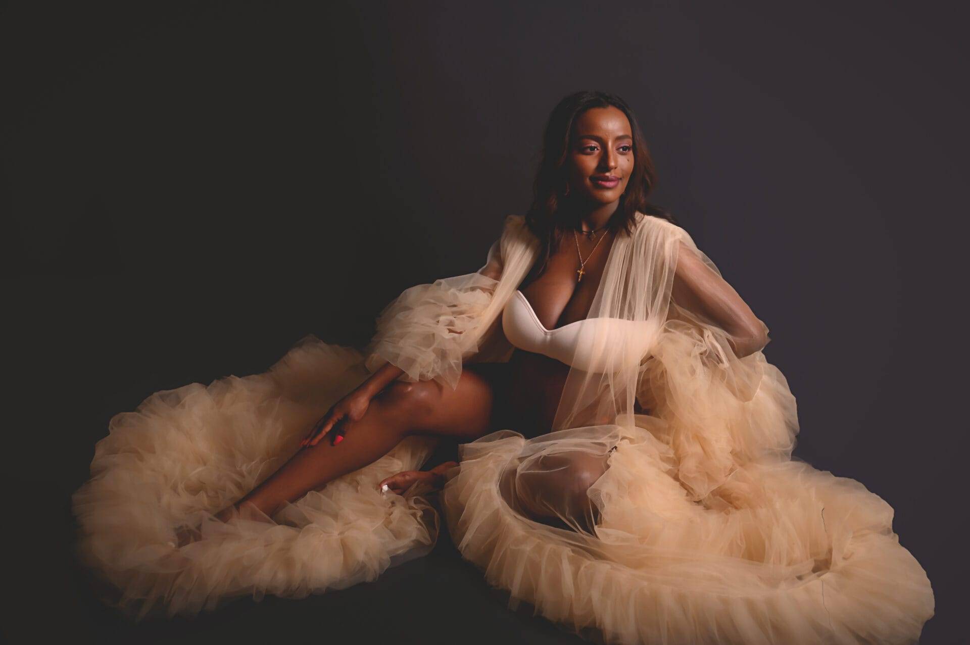
In post-production, the raw image is transformed into a piece of art. This stage allows for the fine-tuning of colors to ensure they accurately reflect the intended vision and mood. It’s a delicate balance of respecting the authentic colors captured on the day and enhancing them to create the final piece. I often employ techniques like selective color grading, dodging and burning, or even converting to black and white to emphasize the story’s emotional core.
Color theory is a cornerstone of visual storytelling, especially in the realm of family portrait photography. It informs every aspect of the process—from planning and execution to post-production and final presentation. As we explore the relationships between colors, the emotions they evoke, and the stories they tell, we open up new possibilities for creating family portraits that are not only visually stunning but also emotionally impactful.
If you’re as passionate about the power of color in photography as I am, I invite you to subscribe to my blog for more insights, tips, and inspiration. For those ready to bring the vibrant story of their family to life through color, reach out to learn more about booking your own family photography session. Together, we will craft a family portrait that transcends the ordinary, creating a lasting legacy that will be treasured for generations.
Embark on this colorful journey with me; let’s paint a picture that captures the true colors of your family’s story. Subscribe to my blog, and let’s create something extraordinary together.